Problem 1.34 from the book asks for a histogram of the ratio of healthy omega-3 oils versus omega-6 oils in food. The data is contained in a spreadsheet foodoils.xls.
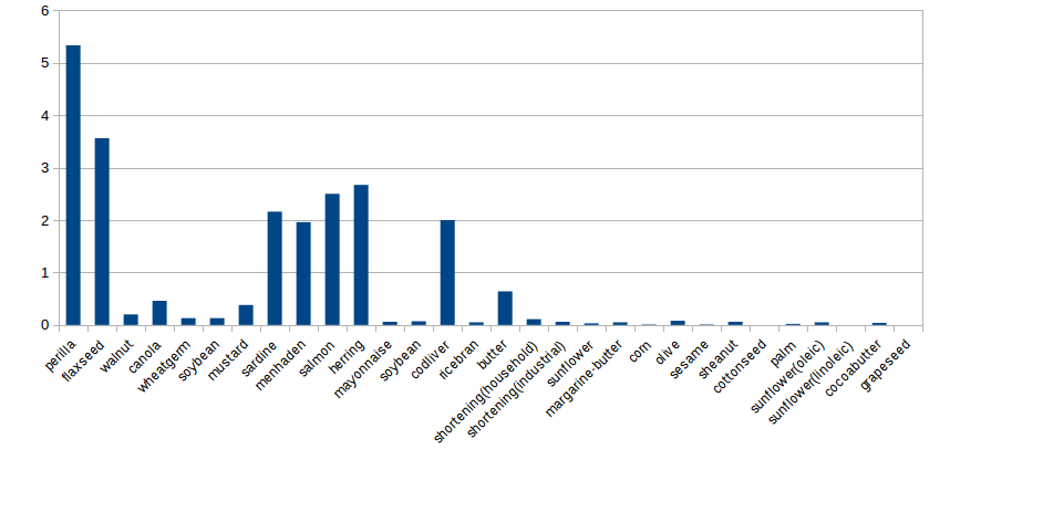
If you just insert a column chart with the data as is in the spreadsheet, you might get something like this.
This is not a histogram! Histograms are a way to display one quantitative variable. The chart above shows two variables:
The chart above does not help us understand the distribution very much. It doesn't give us an intuition about the shape, center, and spread of the distribution of ratios.
The only variable that matters in the histogram is the quantitative variable Ratio of Omega-3 to Omega-6. Here is a list of the values we care about sorted from smallest to biggest.
0, 0, 0, 0.01, 0.01, 0.02, 0.03, 0.04, 0.05, 0.05, 0.05, 0.06, 0.06, 0.06, 0.07, 0.08, 0.11, 0.13, 0.13, 0.2, 0.38, 0.46, 0.64, 1.96, 2, 2.16, 2.5, 2.67, 3.56, 5.33,
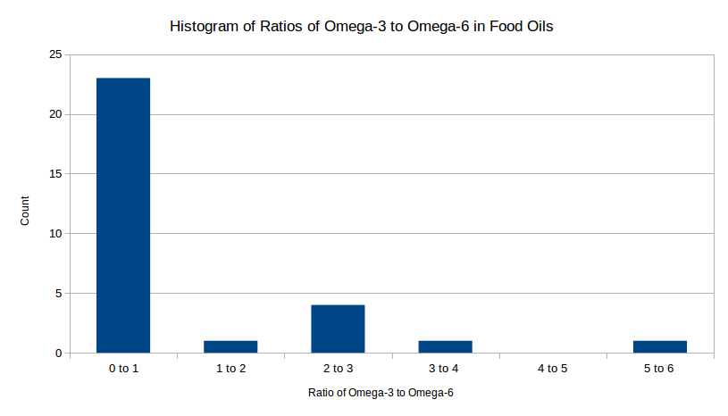
The book tells us to use classes (AKA bins) that are bounded by whole numbers. So the smallest bin will be from 0 to 1, then 1 to 2, and so on up to the last bin which contains the largest piece of data.
| Bin | Count |
|---|---|
| 0 to 1 | ? |
| 1 to 2 | ? |
| 2 to 3 | ? |
| 3 to 4 | ? |
| 4 to 5 | ? |
| 5 to 6 | ? |
Now you just need to count how many numbers are in each bin. The only numbers in the 5-hundred bin are 544, 574, 580 so the count for that bin is 3. Counting the rest of the bins gives:
| Bin | Count |
|---|---|
| 0 to 1 | 23 |
| 1 to 2 | 1 |
| 2 to 3 | 4 |
| 3 to 4 | 1 |
| 4 to 5 | 0 |
| 5 to 6 | 1 |
Now when you make a column chart in Excel or Calc with these two columns, what you get is a histogram. Here is the histogram I made: